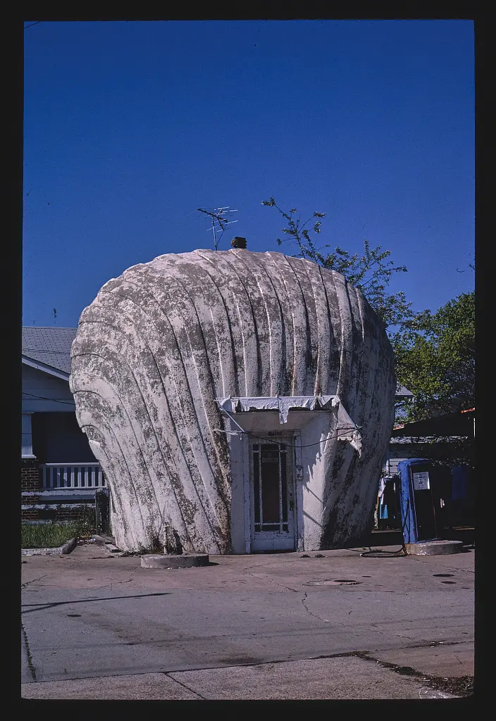
A brand mark normally sits on a building. At this Winston-Salem station, the relationship was reversed: the building took the mark's shape. John Margolies photographed the Shell station in 1980, according to the Library of Congress catalog.[1] The subject demonstrates how a very small commercial structure can make an unusually direct statement about the product associated with it.
A dated account from North Carolina's Department of Natural and Cultural Resources identifies R. H. Burton as the builder and places construction in 1930. It describes the station as one of eight created around Winston-Salem in a marketing effort involving Shell and local affiliate Quality Oil.[2] The shell was a repeatable commercial idea before it became an individual preservation subject.
The state account explains the method of construction: builders enclosed the office, added a shell-shaped wire framework, and applied concrete in a stucco-like manner. It also records National Register listing on May 13, 1976.[2] Behind the emblem was an ordinary need for enclosed working space; around it, a shaped surface made the business visible and memorable.
This sequence is a useful way to understand mimetic architecture. The form does not need to determine every interior detail. A practical room can sit within a more expressive outer shape. The shell's job is partly communicative, helping a driver connect a place with a brand before stopping. The office's job is to support the business once the stop has been made.
The design can be read as an unusually complete merger of sign and building. It reduces the distance between recognizing a symbol and recognizing an address. Yet its effectiveness also depends on repetition beyond the site: a customer who already knows the emblem brings that recognition to the encounter. The station turns a shared graphic language into something spatial.